
Nestlé


The Red Nestlé Plate, 1996
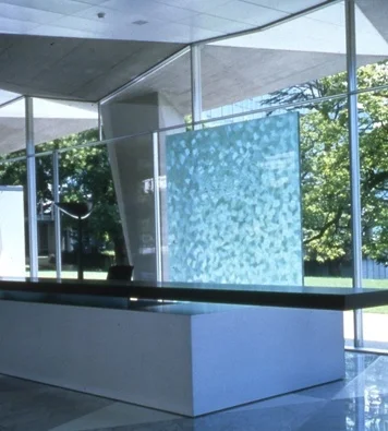
Nestlé Headquarters, 2000
Nestlé Innovation Award, 2001
The Nestlé project was probably one of the most gratifying design projects, if not the most difficult, we have ever undertaken. Our idea was originally based on a house present given to us by a friend – a glass disk he had found in an antique shop. The concave side was smooth, the convex side covered in tiny protruding dots. It was modern design at its most exquisite. And it was bright red in colour. It was the glass covering for a red traffic light! We were so taken by the concept that we actually presented the object as it was as the conceptual basis for what we might do for Nestlé. The folks at Nestlé were a little shocked but eventually saw the attraction. We found common ground when everybody realized that we could replace the uniform dots with a version of our own inciso cutting, reflective of the artwork we had already begun working on in earnest in our own studio. We studied nineteen different glass factories as potential suppliers (18,000 pieces were required). We narrowed the field to four, and each one of them was a completely industrialized factory making traffic lights for cars and trains. Only one of these four factories came close enough to having the quality of ruby red glass necessary to the standard of our project. The piece was ultimately done by automatic press, using two highly polished alternating stainless steel moulds which had been computer-generated and taken directly from one of more than a dozen free-hand samples we had blown in our studio and cut on Murano.
The whole project was a case of collaboration at its best and most challenging. Everyone took serious risks: the design director at Nestlé, ourselves, the head of Nestlé (for sticking with ruby when blue would have been without complication) and most of all the little factory in Germany that did the job. More than twenty people were involved in hand-polishing the borders, cleaning the plates and lightly oiling them after sandblasting in order to create the same effect as our originals. It was an effort in commitment to exellence, involving serious innovation and flexibility on the part of everyone involved. The final result was an elegant object directly based on a red traffic light.
Excerpt from « In Search of Clear Lines » 1998
Project realised in 1996